Uncategorized
5 Insta-worthy Colourful Home Designs For Inspirations
Home interiors using neutral colour schemes such as grey, beige and browns are timeless and we can see why so many homeowners love these colours! They create a warm and relaxing space that invites homeowners to unwind and feel rested. Its neutral colours also make it easy for the homeowners to update and refresh the look of their home easily with new furniture in Singapore!
While most homeowners might prefer using neutral colours for their home designs, these homeowners had beautifully incorporated their favourite colours to create a bright and cheerful space that will certainly wow any guests who enter their home. Check out these 5 amazing and insta-worthy colourful home designs for some inspirations for your renovation in Singapore!
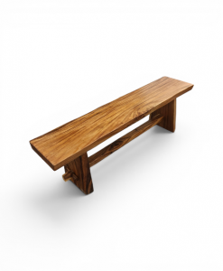
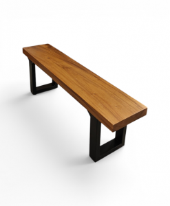
Dining Tables
1 in stock
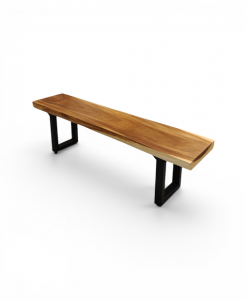
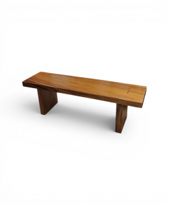
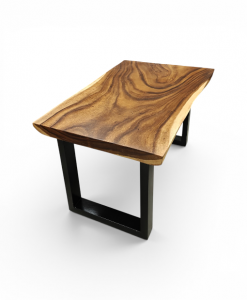
Dining Tables
1 in stock
1 in stock
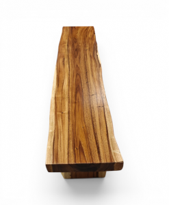
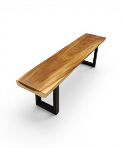
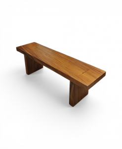
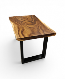
Dining Tables
1 in stock
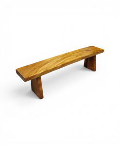
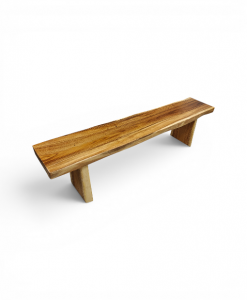
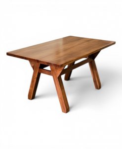
Dining Tables
1 in stock
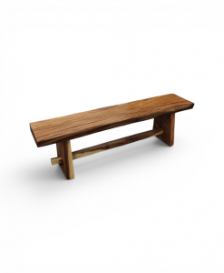
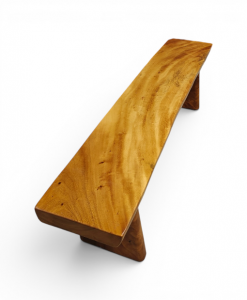
Dining Tables
1 in stock
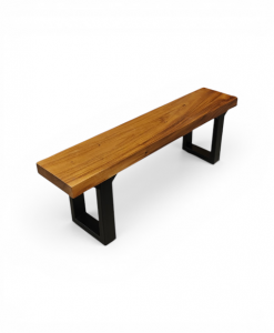
Dining Tables
1 in stock
Dining Tables

source: Pinterest
Pastel Tones
This homeowner has chosen pastel tones for the living room to add colours to the home yet they are fairly easy to work with at the same time! Pastel colours are gentle with its soft hues, making it easy to pair it up with any other colours. The colourful wall painting and rug tie in nicely to the whole look of the space, making it a dreamy pastel abode that’s fun to hang out in with friends and family!

source: Pinterest
Play With Colourful Accessories
With white as its base colour, this kitchen uses colourful bar stools to add splashes of colours to an otherwise simple and monotone kitchen, making it a fun space where creativity can run free for the creation of new and delicious dishes! It’s also a space that allows guests and homeowners to interact in the kitchen while the homeowner prepares dishes.
Keeping everything simple while adding colours only to an area is a useful trick to draw your guests’ attention to the specific place you want them to focus on!


1 in stock

Sofas
1 in stock


1 in stock


1 in stock


1 in stock

Sofas


1 in stock


Sofas
1 in stock

source: Pinterest
Match Bold Complimentary Colours
If you have a favourite color in mind but is unsure what other colours would complement it, a useful tip is to look at a colour wheel. When using a colour wheel, look at the colour that is directly opposite the main colour for its complementary colours. Just like this pink piano against the blue wall, both colours might look too bold to be in the same space, but you’ll be in for a surprise to see how well they turn out together!

source: Pinterest
Neon Colours
Other than pastel colours, did you know that all neon colours work well together too? No matter how many neon colours you choose for your space, they will look good together! Take a look at this room – it has a neon yellow bohemian-print wallpaper along with a bright neon pink study desk and a flowery neon blue chair that all blends well together!

source: Pinterest
Make A Statement
If having too many colours is overpowering, just choose one large furniture and make that your statement piece and use muted colours for the rest of the furnishings in the space. This neon pink armchair is definitely an eye-catching one, don’t you think?